Visual explainer
ROC and AUC
Sweep decision cutoffs to trace True Positive Rate against False Positive Rate, measuring threshold-independent ranking discrimination via Area Under the Curve.
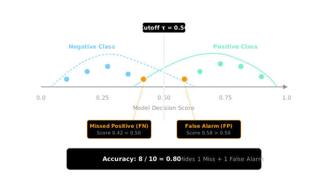
A binary classification model outputs a continuous decision score for every incoming instance. To produce an actionable categorical verdict, engineering teams select a decision threshold . When the cutoff is pinned arbitrarily at , global classification accuracy can report an apparently solid ( correct classifications out of cases).
However, a single scalar accuracy score masks two fundamentally distinct operational failures:
- False Negative (Miss): A true positive case receives score , escaping detection entirely. In medical diagnostics or fraud detection, a false negative incurs catastrophic downside.
- False Positive (False Alarm): A clean negative case receives score , triggering an unnecessary intervention that wastes investigation bandwidth.
Evaluating a model at only one fixed cutoff conceals whether errors stem from overlapping feature representations or simply an uncalibrated threshold. A complete evaluation requires sliding the cutoff across the full spectrum .
Counts Become Rates
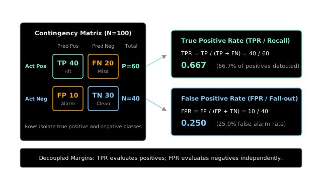
At any given cutoff , predictions populate a standard contingency matrix across evaluation instances ( actual positives, actual negatives):
- True Positives (): Correctly alerted events.
- False Negatives (): Undetected events.
- False Positives (): Spurious alerts.
- True Negatives (): Correctly ignored negative instances.
Rather than collapsing these counts into aggregate accuracy, the Receiver Operating Characteristic isolates performance across the true positive and true negative populations independently:
True Positive Rate (Sensitivity or Recall) measures the proportion of actual positives captured. False Positive Rate (Fall-out) measures the proportion of clean negatives incorrectly flagged as alarms. Because each rate computes against its own row marginal ( and ), TPR and FPR remain decoupled from each other and invariant to class prevalence shifts.
Slide Into a Curve
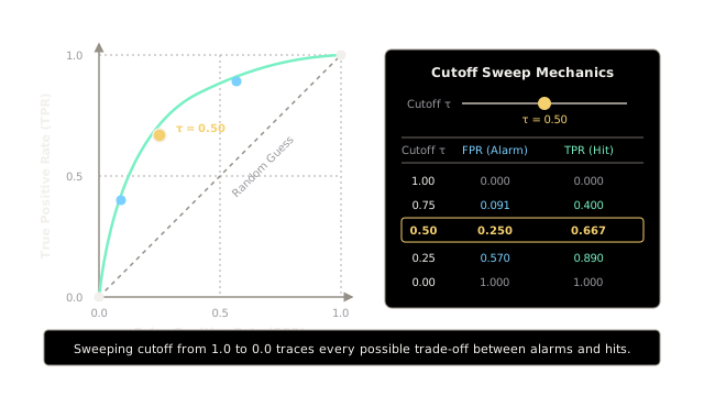
Sweeping the decision cutoff continuously from down to generates a parametric trajectory in ROC coordinate space :
- Strict Limit (): The model classifies every case as negative (). Coordinates start at the origin . No false alarms occur, but zero positives are caught.
- Conservative Operating Range (): The model flags only unmistakable cases, yielding low alarms () and moderate recall ().
- Balanced Operating Range (): The midpoint cutoff produces our contingency point .
- Sensitive Operating Range (): Relaxing the threshold captures of positives () at the cost of elevated false alarms ().
- Permissive Limit (): The model flags every case as positive (). Coordinates terminate at .
The diagonal line connecting to represents uninformative random guessing. A learned classifier forms a convex curve arching toward the ideal upper-left coordinate , visually illustrating the exact tradeoff available between hit rates and false alarms.
Area Reads Ranking
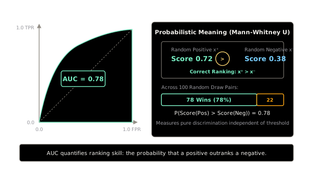
Integrating the area under the ROC curve yields the Area Under the Curve (AUROC or AUC):
AUROC provides a single scalar between (random guessing) and (perfect separation). By the Wilcoxon-Mann-Whitney statistic theorem, AUROC possesses an exact probabilistic equivalence:
An AUC of means that if you draw one positive sample and one negative sample at random from the population, the model will assign a higher score to the positive instance of the time.
AUROC evaluates overall discrimination capacity across all possible thresholds simultaneously. It reflects how cleanly the model separates positive and negative score distributions, free from the specific threshold chosen for production deployment.
One Curve, Two Jobs
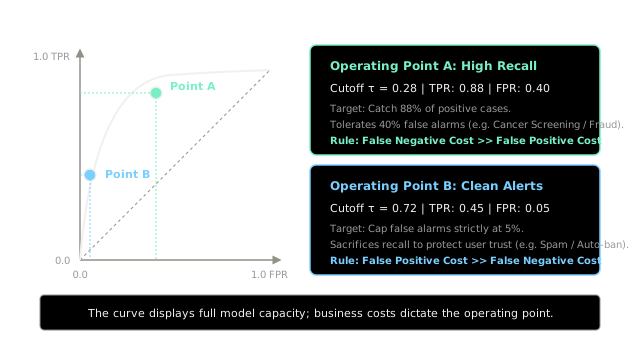
While AUROC benchmarks the general separation power of a model during offline research, deploying the model to production requires pinning a single operational cutoff on the curve. That selection depends entirely on the asymmetric cost ratio between false negatives () and false positives ():
The exact same model curve supports divergent operational contracts:
- Operating Point A (High Recall): Setting achieves with . This operating point fits high-stakes safety missions (such as cancer screening or anti-money laundering triage), where missing a true case () carries severe regulatory or human penalties.
- Operating Point B (Clean Alerts): Setting restricts false alarms to while securing . This operating point fits consumer-facing automation (such as spam filtering or automated account bans), where nuisance false alarms () destroy user trust.
The curve describes what the model is capable of; business utility determines where to operate.
Rare Means Switch Plots
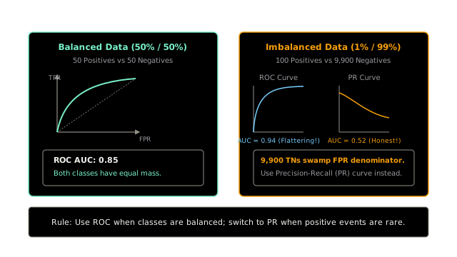
AUROC behaves reliably when class distributions are roughly balanced. However, when positive events are rare—such as credit card fraud ( in ) or ad click prediction ( in )—ROC curves become deceptively optimistic.
The vulnerability lies in the denominator of the False Positive Rate:
When the negative class contains items and the positive class contains items, generating false alarms yields:
In ROC space, an of appears virtually invisible on the horizontal axis, keeping the ROC curve pinned against the top-left ceiling and inflating AUROC to .
However, examining precision reveals the real operational impact:
Half of all dispatched alerts are false alarms. Precision-Recall (PR) curves replace FPR with Precision, exposing how false alarms dilute alert purity. In heavily imbalanced regimes (), evaluate with Precision-Recall curves (PR AUC / Average Precision) rather than ROC.
Where It Breaks
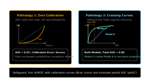
Relying exclusively on AUROC introduces two critical blind spots into production machine learning pipelines:
1. The Calibration Blind Spot
AUROC depends strictly on rank ordering: any monotonic transformation of scores (where ) preserves pairwise ranks and leaves AUROC completely unchanged. If a model predicts probabilities , a true event with probability is reported as , and a event is reported as . AUROC remains a flawless , yet downstream risk management engines receiving these distorted probabilities will misprice risk or trigger incorrect automated limits. Safeguard pipelines by pairing AUROC with Expected Calibration Error (ECE) and reliability diagrams.
2. The Crossing Curves Fallacy
Two competing models can share identical aggregate AUROC values (e.g. ), yet exhibit opposite performance across operational regions. Model A may dominate in the ultra-low false alarm zone () before plateauing, while Model B struggles at low FPR but captures marginal cases at loose thresholds. If production requires a strict false alarm ceiling (), Model A is vastly superior despite identical aggregate AUC. In production systems, report partial AUC () restricted to the viable operational FPR window.
The Quick Version
- A single cutoff hides operational misses behind an aggregate accuracy metric.
- Calculating TPR and FPR from contingency rows isolates positive detection from negative specificity.
- Sweeping the decision cutoff from to traces the complete ROC trade-off curve.
- AUROC quantifies pairwise ranking concordance: the probability that a positive outranks a negative.
- The same ROC curve supports high-recall safety triage or high-specificity clean alert regimes.
- In severe class imbalance, true negative swamping flatters AUROC; switch to Precision-Recall curves.
- AUROC remains blind to probability calibration and crossing curve dynamics; pair with ECE and partial AUC.