Descriptive Statistics
The handful of numbers that summarise a column of data — and the reason one of them alone will mislead you about almost any real dataset.
Why Does This Exist?
SimpleImputer(strategy="mean") is one of the most common lines in a data pipeline, and on skewed data it is the wrong choice. Latency, income, session length, token counts and file sizes are all right-skewed with long tails, and filling missing values with the mean pushes every imputed row toward a value that few real rows have.
This is the page that makes that decision informed rather than default. Three concrete payoffs:
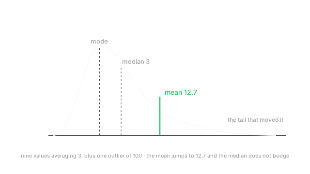
- Which centre to impute with. Mean for symmetric data, median for skewed. The diagram shows how far apart they get.
- Which correlation to trust. Pearson measures straight-line association and inherits variance's sensitivity to outliers; Spearman works on ranks and does not. Picking the wrong one produces confident nonsense.
- Where your outlier thresholds come from. The rule and the 3-sigma rule are different rules with different failure modes, and one of them breaks precisely when outliers are present.
Think of It Like This
Describing a room of people with one number
Nine people in a room earn around £30,000. Then a billionaire walks in.
Ask for the average income and it is now over £100 million — a number that describes nobody in the room. It is arithmetically correct and completely useless as a summary.
Ask for the median, the person in the middle, and it is still about £30,000. Nine of the ten people are well described by it. The billionaire moved the median by one position and barely changed its value.
Now ask about spread. The standard deviation is astronomical, because it squares distances from that inflated mean. But the gap between the 25th and 75th percentile — the middle half of the room — is a few thousand pounds, and that describes the actual variation among almost everyone.
Neither summary is wrong. They answer different questions, and the skew is what makes them diverge. On symmetric data they would agree and the choice would not matter.
How It Actually Works
Four families of summary, and you need at least one from each.
Centre. The mean is the arithmetic average, the balance point. The median is the middle value once sorted. The mode is the most frequent value — the only one that works on categorical data.
Spread. The variance and standard deviation measure average squared distance from the mean. The range is max minus min, and is dominated by whichever two points happen to be extreme. The interquartile range (IQR) is the 75th percentile minus the 25th — the width of the middle half.
Shape. Skewness measures asymmetry: positive means a long right tail. Kurtosis measures how heavy the tails are relative to a normal distribution.
Position. Percentiles and quantiles — the value below which a given fraction of the data falls. The median is the 50th percentile.
Robustness is the axis that matters
The single most useful distinction here is how a statistic responds to a few extreme values:
- Mean, variance, standard deviation, range, Pearson correlation — all sensitive. One bad value moves them arbitrarily far, because they are built from sums or squares of raw values.
- Median, IQR, percentiles, Spearman correlation — all robust. They depend on order, so a single extreme value can move them by at most one position.
The median's breakdown point is 50%: you would have to corrupt half your data before it becomes meaningless. The mean's breakdown point is 0% — a single value is enough. That asymmetry is why robust statistics exist as a field.
Two outlier rules, and when each fails
The IQR rule flags anything outside . Built from percentiles, so it is robust.
The 3-sigma rule flags anything more than three standard deviations from the mean. Built from the mean and standard deviation, so it is not robust — and this is the trap. A large outlier inflates the standard deviation it is being compared against, so it masks itself. With a handful of extreme values, 3-sigma can flag nothing at all.
Use the IQR rule, or a robust variant like the modified z-score based on median absolute deviation. Reserve 3-sigma for data you already know is roughly normal.
Worked example
Take nine values: .
Their sum is 27, so the mean is . Sorted, the middle value is the fifth, which is 3. The most frequent value is 3. Mean, median and mode all agree at 3 — the mark of roughly symmetric data.
Now add one outlier: .
The sum becomes 127 over 10 values:
The median is now the average of the 5th and 6th values, . The mode is still 3.
So one value out of ten moved the mean from 3 to 12.7 — a factor of four — and left the median exactly where it was. That is the entire lesson, and 12.7 is larger than nine of the ten data points, which is a summary describing almost nothing in the dataset.
The spread tells the same story. The standard deviation of the ten values is about 29.0, larger than every value except the outlier. The IQR spans roughly 2.25 to 4, a width of about 1.75, which honestly describes the middle half.
And the IQR rule catches it: , and . Meanwhile the 3-sigma rule gives , and only just exceeds it — the outlier inflated the threshold it was tested against until it nearly escaped.
Code
import numpy as npfrom scipy import stats
clean = np.array([1, 2, 2, 3, 3, 3, 4, 4, 5], dtype=float)dirty = np.append(clean, 100.0) # one outlier, shape (10,)
print(clean.mean(), np.median(clean)) # -> 3.0 3.0 they agreeprint(dirty.mean(), np.median(dirty)) # -> 12.7 3.0 mean moved 4x
q1, q3 = np.percentile(dirty, [25, 75])iqr = q3 - q1print(q1, q3, round(iqr, 4)) # -> 2.25 4.0 1.75print(round(q3 + 1.5 * iqr, 4)) # -> 6.625 IQR rule catches 100
# The 3-sigma rule is inflated by the very outlier it should catch.print(round(dirty.mean() + 3 * dirty.std(), 2)) # -> 99.71 only just flags itprint(round(float(stats.skew(dirty)), 3)) # -> 2.667 strong right skewEvery number matches the hand calculation. The last two lines are the masking effect: the robust threshold sits at 6.6 and the non-robust one at 99.7, from the same data.
Watch Out For
Imputing skewed columns with the mean
SimpleImputer(strategy="mean") is the default in most tutorials and the wrong choice for the majority of real numeric columns, because most real numeric columns are right-skewed.
Latency, income, purchase amount, session duration, retweet count, file size — all bounded below at zero with a long right tail. The mean of such a column sits well above the bulk of the data, so every imputed row gets a value that is atypically high. If missingness correlates with anything — and it usually does, since expensive requests time out more often — you have introduced a systematic bias rather than a neutral filler.
Two consequences worth naming. Tree models will happily split on the imputed value, effectively learning "this row had a missing field", which is sometimes useful and always worth knowing about. And any downstream variance estimate is now wrong, because you added a spike of identical values at a point where the real density is low.
Use the median for skewed columns. Better still, add a missingness indicator column so the model can learn that the value was absent rather than having that fact smuggled in through a suspicious constant. And check skewness per column rather than choosing one strategy for the whole frame.
Reporting Pearson correlation on data with outliers or curvature
Pearson correlation inherits both of variance's weaknesses: it only sees straight-line relationships, and a single extreme point can dominate it.
The curvature problem is stark. over a symmetric range around zero has a Pearson correlation of exactly zero while being perfectly determined. Drop a feature because it "does not correlate" and you may have discarded your most predictive one — non-monotone relationships are invisible to it.
The outlier problem is worse because it produces false positives rather than false negatives. Two genuinely unrelated variables plus one point far out in both dimensions can show a correlation above 0.9. The whole coefficient is being carried by one row, and it will not reproduce on new data.
Three habits. Plot it — Anscombe's quartet exists precisely because four datasets with identical correlation look nothing alike. Use Spearman when the relationship may be monotone but not straight, or when outliers are present; it correlates ranks, so it is robust and detects any monotone relationship. And use mutual information when you need to detect arbitrary dependence, including non-monotone.
The Quick Version
- Report a centre, a spread, and something about shape. One number is never a summary.
- Mean is the balance point, median the middle value, mode the most frequent — and the only one for categorical data.
- On symmetric data all three agree. Divergence is the signal that the data is skewed.
- Mean, variance, standard deviation, range and Pearson are sensitive; median, IQR, percentiles and Spearman are robust.
- The median's breakdown point is 50%; the mean's is 0%. One value is enough to ruin a mean.
- One outlier in ten moved a mean from 3 to 12.7 and the median not at all.
- Use the IQR rule for outliers. The 3-sigma rule is inflated by the outliers it is meant to catch, so it masks them.
- Impute skewed columns with the median, and add a missingness indicator.
- Pearson sees only straight lines and is outlier-dominated. Reach for Spearman, or mutual information for arbitrary dependence. Always plot.