Autocorrelation
A statistical metric that measures how strongly a time series is correlated with its own past values, revealing hidden momentum and seasonal patterns.
Why Does This Exist?
If you want to predict tomorrow's temperature, the single best piece of information you can have is today's temperature. If you want to predict the temperature on July 4th, it is very helpful to know the temperature on July 4th of last year.
In time series forecasting, the past is the best predictor of the future. But which parts of the past? Does what happened 3 days ago matter? Does what happened 7 days ago matter?
Autocorrelation is the mathematical tool we use to answer that exact question. It tells us exactly how much "momentum" or "memory" is retained in the dataset across time.
Think of It Like This
Imagine you are watching a heavy freight train.
Because the train is heavy, its speed today is almost identical to its speed one second ago. It has high momentum. If you calculate the correlation between its speed at Time and Time , it will be near 1.0 (perfect correlation).
Now imagine watching a fly buzzing around a room. Its direction at Time has absolutely nothing to do with its direction at Time . It has no momentum. If you calculate the correlation between and , it will be 0.
Autocorrelation measures whether your data acts like a freight train (predictable based on the recent past) or a fly (unpredictable).
How It Actually Works
Autocorrelation literally means "self-correlation". We take the time series, shift it backward by a certain number of time steps (called a Lag), and calculate the Pearson correlation between the original series and the shifted series.
If we shift the data by 1 day, we are calculating Lag-1 autocorrelation (how much yesterday affects today). If we shift it by 7 days, we are calculating Lag-7 autocorrelation.
1. The ACF (Autocorrelation Function)
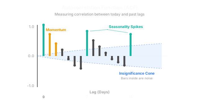
Data scientists never just look at one lag. They plot the autocorrelation for Lag 1, Lag 2, Lag 3... all the way up to Lag 40 on a single bar chart called the ACF plot.
- If the ACF plot slowly degrades from 1.0 down to 0 over many lags, the series has strong momentum (a trend).
- If the ACF plot spikes every 7th lag, the series has a strong weekly seasonality.
2. The PACF (Partial Autocorrelation Function)
There is a catch. If today is highly correlated with yesterday, and yesterday is highly correlated with the day before, then mathematically, today will appear correlated with the day before just by proxy.
The PACF solves this. It measures the pure, direct correlation between today and a past lag, strictly removing the "echo" of all the lags in between. We use the PACF plot to determine exactly how many lagged features to feed into our ARIMA models.
Code
In Python, statsmodels provides out-of-the-box functions to plot both the ACF and PACF.
import pandas as pdimport numpy as npimport matplotlib.pyplot as pltfrom statsmodels.graphics.tsaplots import plot_acf, plot_pacf
# Generate a dummy time series with strong weekly seasonality (Lag 7)np.random.seed(42)days = np.arange(100)# A sine wave with a 7-day period + random noisedata = np.sin(2 * np.pi * days / 7) + np.random.normal(0, 0.5, 100)
ts = pd.Series(data)
# Create a figure with two subplotsfig, axes = plt.subplots(1, 2, figsize=(16, 4))
# Plot the ACF (Look for spikes at 7, 14, 21...)plot_acf(ts, lags=30, ax=axes[0], title="Autocorrelation (ACF)")
# Plot the PACFplot_pacf(ts, lags=30, ax=axes[1], title="Partial Autocorrelation (PACF)")
plt.show()When you run this code, the ACF plot will show massive spikes exactly at Lag 7, Lag 14, and Lag 21, immediately revealing the hidden weekly cycle to the data scientist.
Watch Out For
The Blue Cone of Insignificance.
When you generate an ACF or PACF plot, the plotting library will draw a shaded blue cone (usually representing a 95% confidence interval). Any bars that fall inside this blue cone are statistically indistinguishable from zero. If your Lag-5 bar is inside the cone, it means what happened 5 days ago has zero predictive power for today. Ignore it.
The Quick Version
- Autocorrelation measures how strongly a time series correlates with a delayed (lagged) version of itself.
- The ACF plot reveals long-term trends and repeating seasonal patterns (like spikes every 7 or 12 lags).
- The PACF plot reveals the direct relationship between two time points, removing the proxy effects of the days in between.
- These two plots are the mandatory diagnostic tools used to configure the parameters of an ARIMA model.