Partial Dependence and ICE
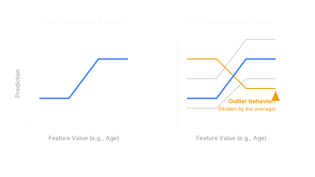
Once you know a feature is important, you need to know exactly how it changes the prediction. PDP shows the average effect across all users, while ICE shows the unique effect on every single individual.
Why Does This Exist?
If you run a permutation-importance test on your credit risk model, you might discover that Age is the most important feature. This is useful, but it is incomplete. How does Age affect the model? Does getting older make you more likely to be approved, or less likely? Is it a linear relationship, or does it peak at age 45 and drop off?
To answer these questions, you need to visualize the exact mathematical relationship the model learned between Age and the final prediction. Partial Dependence Plots (PDP) and Individual Conditional Expectation (ICE) plots exist to draw that exact shape. They allow you to hold every other variable constant and tweak one specific feature to see exactly how the model reacts.
Think of It Like This
Think of evaluating a feature like testing the effect of a new medication on heart rate.
If you give the medication to 1,000 people and calculate the average heart rate change, you create a Partial Dependence Plot (PDP). The PDP might show that, on average, the medication lowers heart rate by 10 beats per minute.
However, an average can be dangerous. What if the medication lowers heart rate by 30 bpm for healthy people, but accidentally raises it by 10 bpm for people with diabetes? The average completely hides this dangerous side effect. To see it, you must graph every single person's individual reaction on the same chart. This spaghetti-like graph is an ICE Plot.
How It Actually Works
Both PDP and ICE are post-hoc, model-agnostic techniques. They are usually generated together.
1. The ICE Plot (Individual Effects)
To understand PDP, you must first understand ICE. An ICE plot shows how a model's prediction for a single specific row of data changes as you alter one feature.
Imagine you want to see how Age affects John Doe's loan approval probability.
- You take John Doe's data row (Income: 60k, Debt: 10k, Age: 25).
- You artificially change his age to 20, feed it to the model, and plot the prediction.
- You change his age to 21, plot it. You change it to 22, plot it, all the way to 80.
- You connect the dots. You now have a single line showing exactly how age affects John Doe's prediction, assuming his income and debt stay exactly the same.
You repeat this process for every person in your dataset. You end up with a chart containing 1,000 thin, semi-transparent lines. This is the ICE plot.
2. The Partial Dependence Plot (The Average Effect)
Looking at an ICE plot with 1,000 intersecting lines can be visually overwhelming. The Partial Dependence Plot (PDP) simplifies this by calculating the mathematical average of all those individual ICE lines at every point on the x-axis.
The PDP provides a single, thick, easily readable line that summarizes the global relationship between the feature and the target. For example, the PDP might show a clear upward slope from age 20 to 50, followed by a flat plateau.
3. Why You Need Both
You should never look at a PDP without looking at the underlying ICE plot. If a feature interacts heavily with other features in the dataset, the ICE lines might cross each other or move in opposite directions.
For instance, Age might increase loan probability for high-income users, but decrease it for low-income users. If you average a line going up with a line going down, the PDP will show a perfectly flat, horizontal line, falsely implying that Age has no effect! The ICE plot reveals the truth: Age has a massive effect, it just depends on Income.
Code
Scikit-learn provides a built-in module for generating both PDP and ICE plots simultaneously.
from sklearn.inspection import PartialDependenceDisplayimport matplotlib.pyplot as plt
def plot_pdp_and_ice( model, X_val: pd.DataFrame, feature_name: str): """ Plots the Partial Dependence (PDP) and Individual Conditional Expectation (ICE) lines for a specific feature. """ fig, ax = plt.subplots(figsize=(10, 6)) # 'kind="both"' plots both the thick PDP average # and the thin ICE lines in the background. display = PartialDependenceDisplay.from_estimator( estimator=model, X=X_val, features=[feature_name], kind="both", ice_lines_kw={"color": "#A3A3A3", "alpha": 0.2, "linewidth": 0.5}, pd_line_kw={"color": "#78F0C4", "linewidth": 3}, ax=ax ) plt.title(f"PDP and ICE for {feature_name}") plt.show()Watch Out For
Extrapolating into Impossible Data
When generating an ICE line for John Doe, the algorithm will artificially set his Age to 15, and then 80. But what if John Doe has an Income of $500,000? A 15-year-old with a half-million-dollar income is an impossible edge case that does not exist in the training data. The model's prediction in this impossible region is essentially random noise, but the ICE plot will draw a line through it anyway. You must interpret these plots cautiously near the extreme edges of the feature distribution.
The Quick Version
- Once you know a feature is important, PDP and ICE plots show you how it changes the prediction.
- An ICE plot draws one line per user, showing how their specific prediction changes as you artificially tweak the feature.
- A Partial Dependence Plot (PDP) is simply the average of all the ICE lines, providing a clean, global summary.
- You must always look at the ICE lines behind the PDP. If the ICE lines go in opposite directions (due to feature interactions), the average PDP line will be flat and misleading.
- Be careful interpreting these plots at the extreme edges of the x-axis, as they often force the model to predict on impossible, unrealistic data points.