ROC and AUC
AUC measures one thing: the chance a random positive scores above a random negative. That's ranking quality, and it can't see calibration or class imbalance.
Why Does This Exist?
A small bank scores every loan application between 0 and 1 for the risk it goes bad — four thousand loans last year, 84 of them defaulted.
Two teams hand you a model each. You cut both at 0.5, count up the results, and model A catches more defaults. Ship A.
Except A wasn't better, just more pessimistic. Its scores run higher everywhere, so a cut at 0.5 flags more of everything. Push B's cut to 0.31 and it matches A on defaults caught while flagging fewer good customers. Two rulers, read at the same tick mark, and not the same ruler.
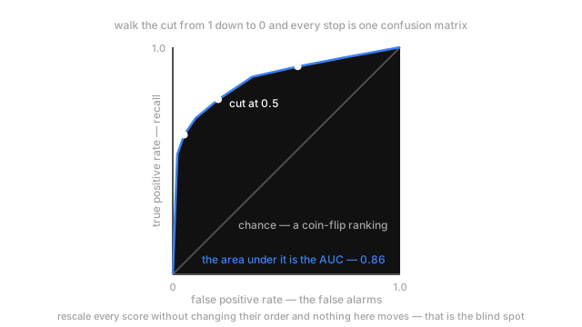
That's what ROC gets around: instead of one cut, sweep every cut from 1 down to 0. The true positive rate is the share of the 84 real defaults you flagged — recall under another name. The false positive rate is the share of the 3,916 loans that repaid that you flagged anyway. Plot one against the other and every point on the curve is one confusion matrix.
Think of It Like This
A blind tasting scored only on the order
Hand a taster twelve unlabelled bottles and ask them to rank them by price. Score them on pairs: take any cheap bottle and any expensive one, and did they put the expensive one ahead? Count how often, across every possible pairing.
Every pair right scores 1.0. Guessing lands near 0.5. Backwards scores 0.
Now what the score can't see. A taster who calls the £15 bottle "about four pounds" and the £80 bottle "about six pounds" gets every pair right and scores a flawless 1.0. Perfect ordering, nonsense numbers. Put them in charge of arranging a cellar, and nowhere near a price list.
How It Actually Works
Sweeping the cut, and why the curve only climbs
Set the threshold at 1 and nothing clears it, so both rates are 0 — the bottom-left corner. Drop it to 0 and everything clears it, so both are 1 — the top-right. In between, the curve.
It never doubles back, and the reason is counting. Lowering a threshold can only add applications to the flagged set, never remove them, so both the caught defaults and the wrongly flagged good loans go up or stay flat. Both rates are non-decreasing, so the curve only moves up and to the right.
The diagonal is the reference. A model scoring at random pulls the same fraction of defaults and good loans above any cut, so its two rates are always equal and it traces the line corner to corner. That's an AUC of 0.5.
The area is a statement about pairs
The area under the ROC curve is the probability that a randomly chosen default scores higher than a randomly chosen loan that repaid. Pick one from each pile, compare their scores, and AUC is how often the ranking gets that pair right. Not an approximation — a theorem, and the code below computes AUC by literally counting winning pairs.
Four things fall out of it. AUC is threshold-free, because pairwise comparisons don't involve a cut anywhere. It's invariant to any monotone rescaling of the scores, because rescaling never changes which of two is larger, so a model whose probabilities are wildly wrong can post an outstanding AUC. Random scoring gives 0.5. And below 0.5 means the ranking is inverted, so flipping the sign gives you and a usable model.
The denominator that hides your false alarms
AUC barely notices class imbalance. That gets sold as a feature. On rare-event problems it's the reason AUC misleads.
Look at the false positive rate's denominator: every loan that repaid, 3,916 of 4,000. Flag 300 good customers wrongly and the rate is , a point still sitting comfortably in the good corner of the plot. If you caught 70 defaults doing it, 370 loans got flagged and 300 were fine. Four in five flags wrong, and the curve looks excellent.
The rate is honest, just measured against a denominator that huge. Nobody staffs a review team in units of false positive rate; they staff it in loans per week.
Code
Counting pairs directly, then breaking the scores on purpose to show what the number ignores.
import numpy as np
def auc_by_ranking(score: np.ndarray, label: np.ndarray) -> float: pos, neg = score[label == 1], score[label == 0] # every (default, repaid) pair the ranking gets right scores 1, a tie scores half wins = (pos[:, None] > neg[None, :]).sum() + 0.5 * (pos[:, None] == neg[None, :]).sum() return float(wins / (pos.size * neg.size))
rng = np.random.default_rng(3)label = (rng.random(4000) < 0.02).astype(int) # 2% of the book defaultsscore = np.clip(rng.normal(np.where(label == 1, 0.62, 0.30), 0.15), 0.0, 1.0)print(f"AUC {auc_by_ranking(score, label):.4f}")print(f"cubed {auc_by_ranking(score ** 3, label):.4f} squeezed {auc_by_ranking(0.4 * score + 0.3, label):.4f}")print(f"mean predicted risk {score.mean():.3f} loans that actually defaulted {label.mean():.3f}")# -> AUC 0.9310# -> cubed 0.9310 squeezed 0.9310# -> mean predicted risk 0.308 loans that actually defaulted 0.021Cubing every score changes each one. Squeezing them into 0.3 to 0.7 changes every one again. AUC doesn't budge past the fourth decimal, because neither operation swaps the order of any pair. The last line is what should worry you: this model claims an average default risk of 31% on a book where 2.1% went bad, at AUC 0.93.
Watch Out For
Reading a high AUC as permission to ship on a rare-event problem
The symptom shows up after launch. AUC 0.94 in the review, everyone happy, and then the review queue takes 900 cases a week when it was staffed for 120. Nobody was wrong about the AUC.
The false positive rate divided your false alarms by an enormous negative class, so the absolute count never appeared in the number you were reading. Translate the operating point into counts before you commit: how many alerts a week at this threshold, and what share are real? That share is precision, and unlike the false positive rate it moves with class balance. Under a few per cent positives, evaluate on the precision-recall curve.
Treating the scores as probabilities because AUC is high
A pricing team takes a 0.93-AUC risk model and sets interest rates from its output, reasoning that good ranking implies roughly right levels. Six months later the portfolio is priced for a 30% default rate on a book defaulting at 2%, and the loss sits in the margin, not the ranking.
AUC is invariant to every monotone rescaling, so it cannot see calibration: a model can be perfectly ordered and uniformly off by a factor of fifteen. If money multiplies the score downstream, check separately — bucket the predictions and compare mean predicted risk against the observed default rate in each bucket. Probability calibration leaves AUC untouched, which is the tell that they measure different things.
The Quick Version
- Sweep the threshold from 1 to 0, plot true positive rate against false positive rate, and every point is one confusion matrix.
- The curve can only climb up and right, because lowering a cut can only add to the flagged set.
- AUC is the probability a random positive outranks a random negative. Everything else follows from that line.
- Threshold-free and invariant to any monotone rescaling, so a badly calibrated model can post an excellent AUC. 0.5 is chance; below it, the ranking is inverted.
- Good for asking whether one model ranks better than another. Bad for asking whether you can ship.